Paint It Bold or Keep It Classic? Cincinnati Homeowners Weigh In on Kitchen Cabinet Colors
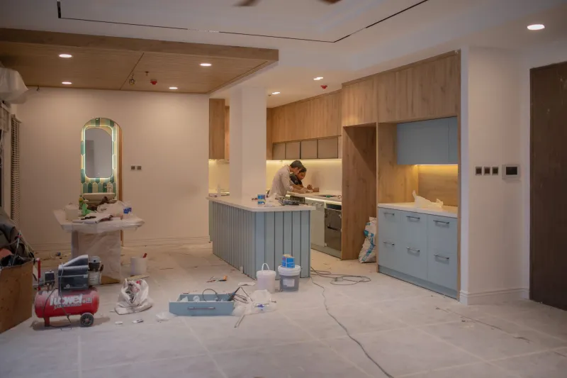
There's a moment in almost every Cincinnati kitchen remodel when the homeowner freezes. The layout is settled, the countertops are chosen, and then someone opens a paint fan deck and suddenly the whole project feels impossibly complicated. Bold navy or warm white? Forest green or greige? It sounds like a fun problem to have—until you remember that cabinets represent a significant chunk of your renovation budget and you'll be looking at them every single morning for the next decade.
The truth is, the right answer depends on a lot more than personal taste. In Cincinnati, your home's architectural DNA plays a huge role in what actually works—not just aesthetically, but in terms of long-term satisfaction and resale value.
Why Cincinnati Homes Are Their Own Design Category
The Queen City has one of the most architecturally diverse housing stocks in the Midwest. Walk through Clifton or Mount Auburn and you're surrounded by ornate Victorian and Italianate homes with high ceilings, tall windows, and original woodwork that practically demands to be honored. Head out to Hyde Park or Madeira and you'll find mid-century ranches and split-levels where clean lines and warm earth tones feel completely at home. Then there are the Over-the-Rhine loft conversions and newer Oakley developments where industrial-chic and contemporary minimalism are the whole point.
Each of these contexts responds differently to color. What looks stunning in a converted 19th-century warehouse can feel completely out of place in a 1958 ranch—and vice versa.
Bold Cabinetry in Victorian and Older Homes: A Case for Going for It
Here's something that surprises a lot of homeowners: bold cabinet colors often work better in older Cincinnati homes than in newer construction. Why? Because those homes already have strong visual character. The crown molding, the transom windows, the original hardwood floors—they create a framework that can absorb and complement a dramatic color choice without feeling overwhelming.
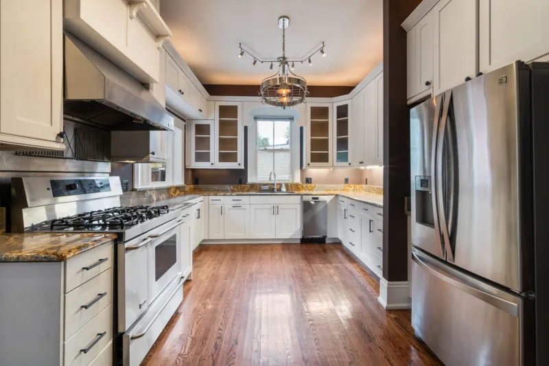
In one Clifton project we completed last year, the homeowners went with a deep, moody blue-green on their lower cabinets paired with off-white uppers. The home was an 1890s Victorian with original plaster walls and period-appropriate tile work. The result didn't feel trendy—it felt like the kitchen had always belonged there. The bold color actually grounded the space rather than fighting with the architecture.
Contrast that with a similar color attempted in a 1970s colonial in Anderson Township. The home's proportions and materials simply didn't have the same depth, and the bold cabinets ended up feeling like a costume rather than a character trait.
The lesson: if your home has strong historic bones, don't be afraid to lean into color. The architecture will catch you.
The Case for Neutrals: It's Not About Being Boring
Let's be clear—choosing a neutral cabinet palette isn't the safe, uninspired option it's sometimes made out to be. In fact, for mid-century Cincinnati homes and contemporary spaces, a well-executed neutral kitchen can be far more sophisticated than a trendy bold choice.
Warm whites, soft putty tones, and greige (that gray-beige hybrid that refuses to go away) continue to dominate renovation projects across neighborhoods like Hyde Park and Blue Ash. And there's a reason for that. These palettes flex. They work with natural wood accents, they don't fight with colorful backsplashes or statement light fixtures, and they photograph beautifully—which matters more than ever in a market where buyers often fall in love with a home on Zillow before they ever step through the door.
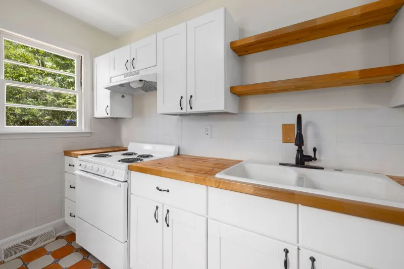
For mid-century homes specifically, a warm white or creamy off-white cabinet paired with walnut hardware and open shelving hits a sweet spot between period-appropriate and genuinely current. It doesn't feel like a museum, and it doesn't feel like a renovation that's chasing a trend it'll regret in five years.
What 2025 Is Actually Bringing to Cincinnati Kitchens
Color forecasters have been talking up earthy, nature-adjacent tones for a couple of years now, and that momentum is continuing. Sage green, terracotta-adjacent clay tones, and warm taupes are showing up consistently in projects across the city. What's interesting in the Cincinnati market specifically is that these colors are landing differently depending on the neighborhood.
In more urban settings—think the newer condo developments along the riverfront or renovated spaces in Pendleton—we're seeing homeowners pair muted sage lowers with concrete-look countertops and matte black hardware for a look that feels both organic and industrial. It works because the surrounding architecture is neutral enough to let the kitchen be the statement.
In established family neighborhoods like Kenwood or Montgomery, the same sage reads a little softer, often paired with white uppers and warm brass fixtures. Same color family, completely different mood.
What we're not seeing much of anymore: the all-white-everything kitchen that dominated the mid-2010s. It's not gone, but it's lost its grip as the default choice. Homeowners are more willing to commit to personality now.
The Resale Question: Does Bold Cabinet Color Hurt Your Home's Value?
This comes up constantly, and the honest answer is: it depends on execution more than color choice. A beautifully done navy kitchen with quality materials and thoughtful hardware will not hurt your resale value in Cincinnati. A sloppily painted trendy color on cheap cabinet boxes absolutely might.
What local real estate professionals consistently tell us is that buyers respond to cohesion. A kitchen that feels intentional—where the colors, materials, and finishes all speak the same design language—reads as high quality regardless of whether the cabinets are white or charcoal. A kitchen that feels like a series of disconnected decisions makes buyers nervous, even if every individual choice is technically fine.
If resale is a genuine priority (and in Cincinnati's active real estate market, it often is), the safer play is to put your boldest color choices into elements that are easier to change—a statement backsplash, a painted island, a colorful range. Save the more neutral palette for the perimeter cabinets that set the overall tone.
Making the Call for Your Kitchen
So how do you actually decide? A few questions worth sitting with:
How old is your home, and what's its dominant architectural character? Older homes with strong original details tend to handle bold color better. Newer builds often benefit from restraint.
How long are you planning to stay? If you're renovating for yourself and you're not moving for a decade, you have more freedom to follow your gut. If you're renovating with an eye on selling in the next few years, lean toward palettes with broader appeal.
What's the light situation in your kitchen? North-facing Cincinnati kitchens with limited natural light can turn a beautiful deep green into something that feels like a cave. Bold colors need good light to do their job.
What do you actually love? This sounds obvious, but it matters. The best kitchen renovation is one you're genuinely excited to live in every day.
The color debate doesn't have a universal winner. But in Cincinnati, where the housing stock is as varied as the neighborhoods themselves, understanding your home's architectural context is the clearest path to a decision you won't second-guess.